Italian Cinema Posters
 Maro (Finished Artwork)
 Nano (Finished Artwork))
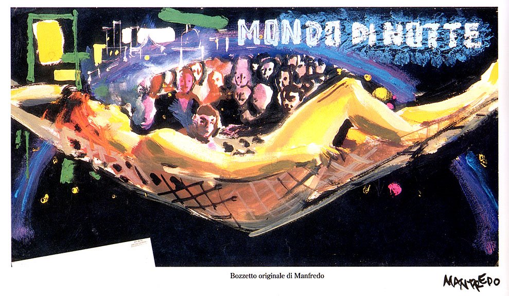 Manfredo (Rough)
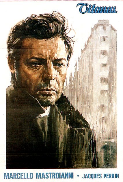 Maro (Finished Artwork))
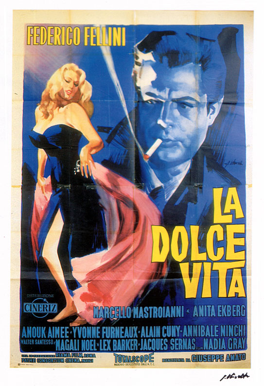 G. Olivetti (Finished Artwork)
 Manfredo (rough)
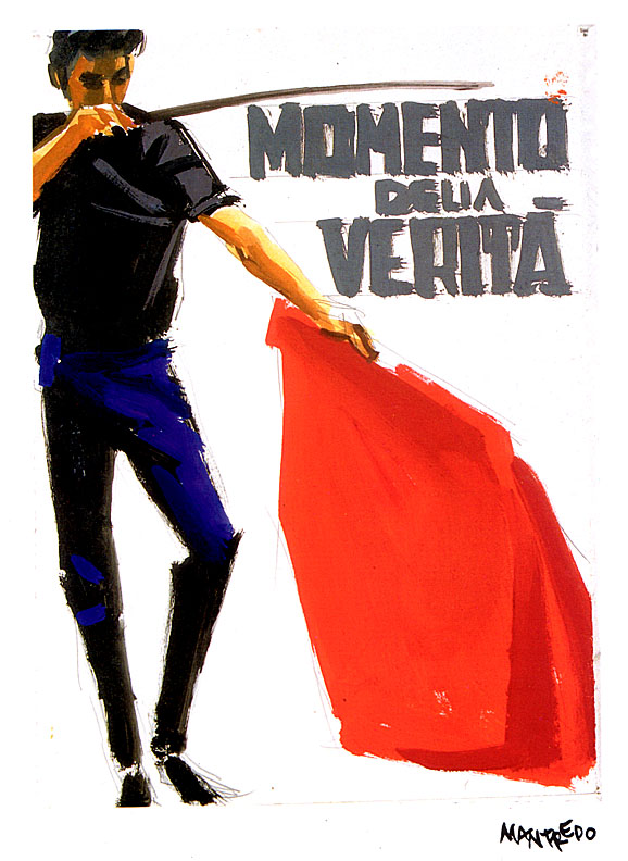 Manfredo (Rough)
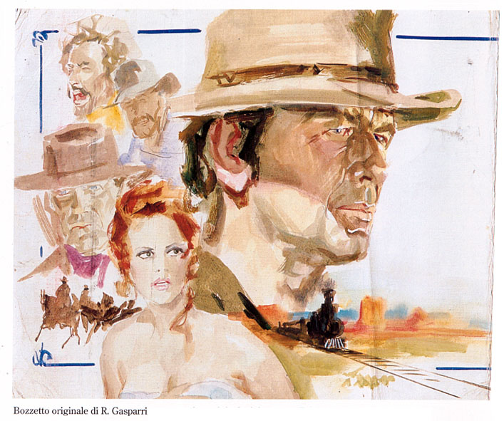 R. Gaspari (Rough)
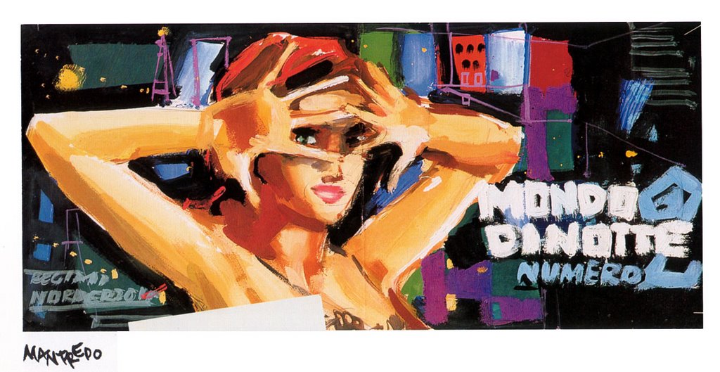 Manfredo (Rough)
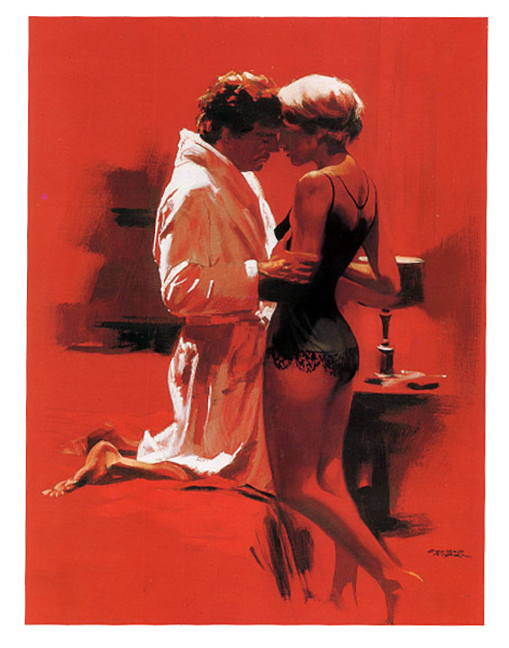 G. Nistri (Rough)
Italian film posters from the fifties and sixties. I passed many hours in the lobby my local cinema in Buenos Aires admiring these gorgeous and evocative illustrations. And most of the films were wonderful too. See Martin Scorsese's documentary on Italian cinema if you don't believe me
posted by Oscar Grillo at 1.5.06
![]()

16 Comments:
The second from the top my favorite and last one.:O)
Me, I'll take the Manfredos.
Something that hadn't occurred to me before:
Is there some co-relation between good cinema and good cinema graphics?
You may know of David Fincher?
He directed Fight Club and Seven among others.
I heard him talking about movie posters and marketing and he made a bitter but entertaining comment.
He talked about how marketing departments see their job as to "save the film".
Everyone got togther and made something crap and now it's the marketing teams job to solve the problem.
this computer has an irritating function that turns keywords into links....
I enjoy enormously going to your linked words places, Elliot.
The argument of marketing films and graphics is excellent, Limbolo...I don't have an immediate idea but the work of Saul Bass comes into mind. I always remember the extraordinary association between graphics and the movie in works like "Vertigo", "The man with the golden arm", "Around the world in eighty days" Etc...Even "The Pink Panther" animation is a good example.
it does it automatically!
I shall type a list and see what it links.
porn
tits
arse
nipples
umbrella stand
Pity!!!!I was looking forward to see where "Umbrella Stand" may take us to.
I daresay one could find a good movie or two hiding behind crappy poster graphics.
But let's stick to the good stuff: Mike Leigh's TOPSY TURVY - a very superior movie - had great poster art.
Hans Bacher's wonderful, simple LION KING logo has made it around the world accompanying the stage show. (This is particularly astonishing for a Disney project.)
Methinks the Italian ad-people of the 50's were not aiming their work at the adolescent audience which nearly every contemporary movie is hoping to herd into the cinemas.
And book covers!...My god what a sticky mess. Even V.S. Naipaul is being published between covers that would do for Mills and Boon.
OK, enough curmugeonry for now..I'm off in search of the lowest common denominator.
Bellisimo!!
(I never noticed the disabled guy nxt to the word verification before! Is there some correlation between these comments & that graphic)
Fincher's title seqs are the best around - the 'oblangata' opening shot travelling through the brain is said to be the most expensive title seq. EVER!! $1 million according to the DVD commentary.
Of course Se7en's titles are exemplary.
Found this on IMDB about the killer's journals:
'All of John Doe's books were real books, written for the film. They took two months to complete and cost $15,000. According to Somerset, two months is also the time it would take the police to read all the books.'
Neil - Topsy Turvy is both a terrific film and one that I watched again only a few days ago.
Matt - I agree!
TOPSY TURVY is tops, wish Leigh would lighten up & make more like it! The actor who played opposite Broadbent was great - who IS that guy?
It wasn't me.
T.T. is the only film by Mike Leigh I can tolerate.
Sullivan was played by Allan Corduner.
I just checked IMDB. There was a sample poster on display. The usual crap. What happened to the original?...Did I imagine it?
Come come Oscar, my dear chap, TOPSY-TURVY is surely worth more than mere toleration?
Yes.is true, but if you knew how much I dislike Leigh's other work, toleration is high praise indeed...The art direction of T.T. and the acting are fabulous...Not to mention the wonderful music.
I have a friend who so dislikes Mike Leigh's films that I cannot persuade him to even watch TOPSY TURVY.
I have read Leigh's comments on the film and found it strange how much he seemed to 'distance' himself from it. I wonder what lies behind that.
Re. Art Direction.
We haven't seen such a gorgeously coloured English movie since Michael Powell's time.
Today walking away from the British Museum I came accross Mike Leigh and I wondered how would have been if I stopped him and told him about our commentaries...He looks like a nice guy anyway. I worked few times with his ex, Alison Steadman.
Post a Comment
<< Home